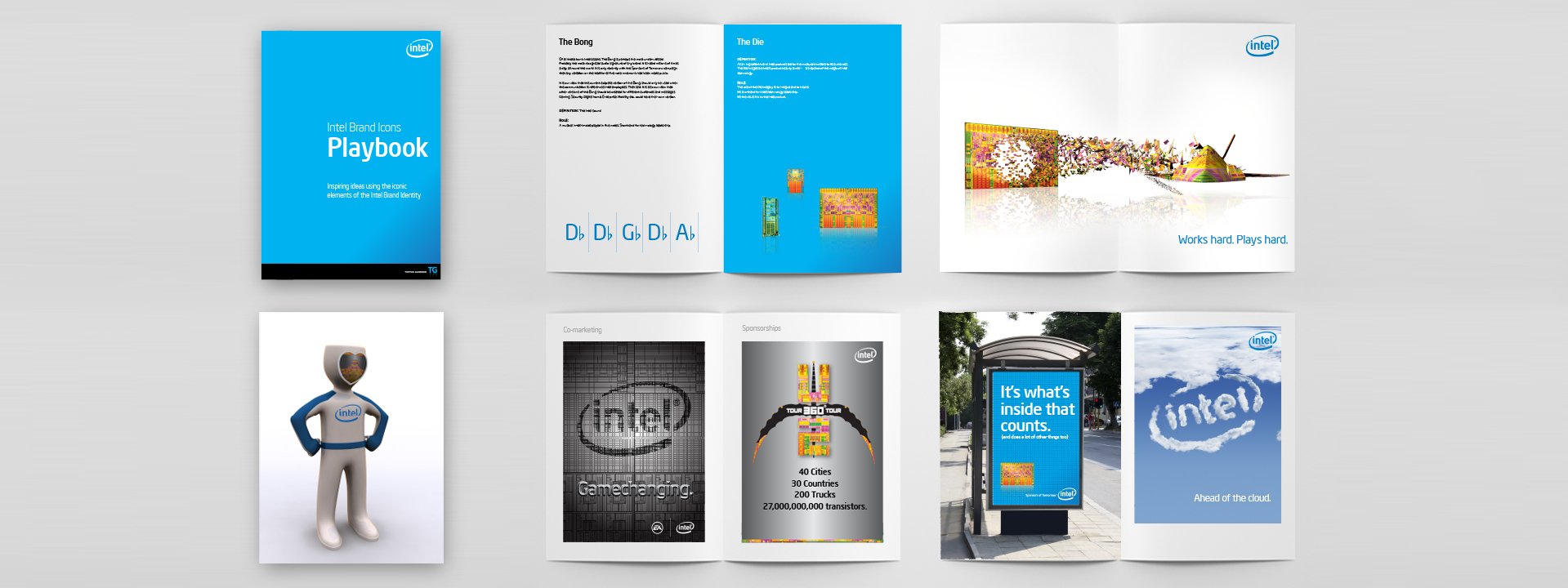
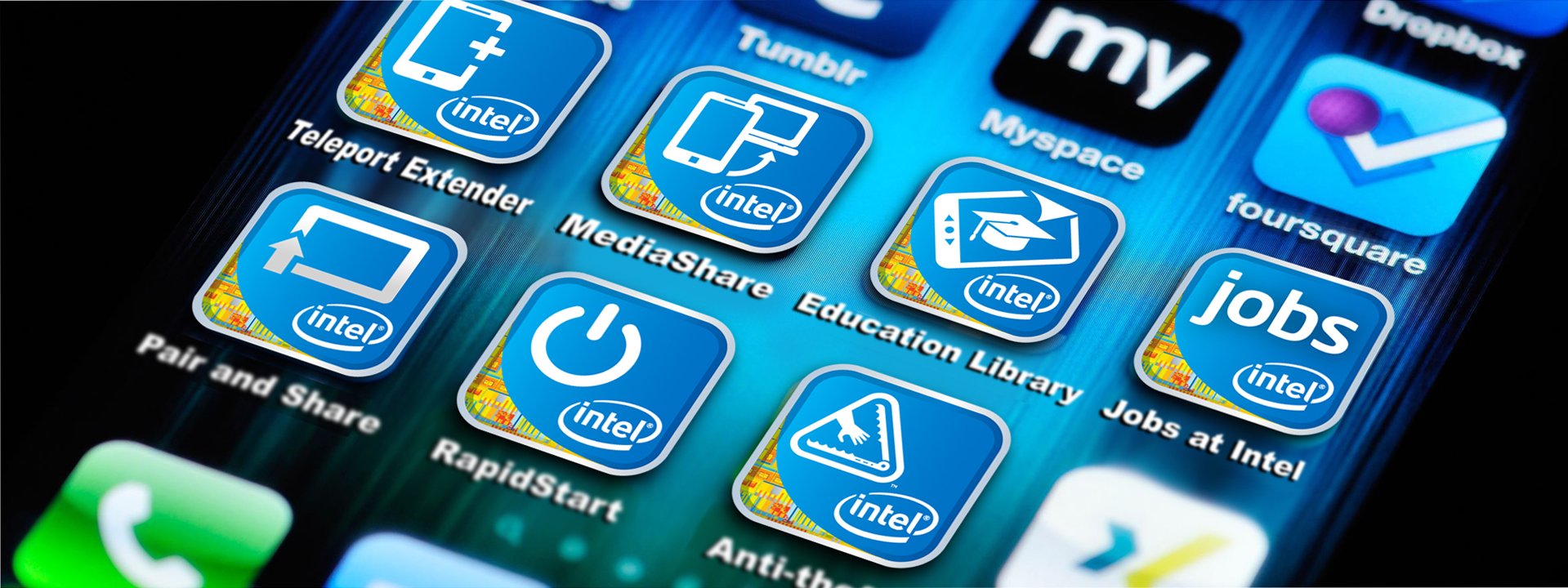
TippingGardner’s relationship with Intel began when Paul Gardner as Creative Director at FutureBrand, led the rebranding of Intel starting in 2005. With the forming of TippingGardner, Intel became a client of ours and we have worked with many projects on them over the years. We have created brand playbooks showing how the elements of the Intel visual identity can evolve, icon and UI design, art direction of brand imagery and co-branding and co-marketing initiatives.
In 2005 Intel had a 40 year old logo that was no longer relevant (or recognized), a well known product brand in Pentium that was soon to be superceded by the new Core chip architecture and the ubiquitous “Intel Inside” identifier for arguably one of the greatest co-marketing programs ever. The challenge was twofold – products and the Intel inside program didn’t properly benefit the Intel brand itself, and while Intel inside sounded great, it needed some more definition. Paul and team firmly linked both “inside” and the products themselves to the newly designed Intel brand – and then creating stylized renderings of the chips to add a magical, tangible and recognizable image for what was “inside”.